Wednesday 26 October 2011

Favourite and Final website design


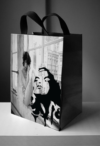
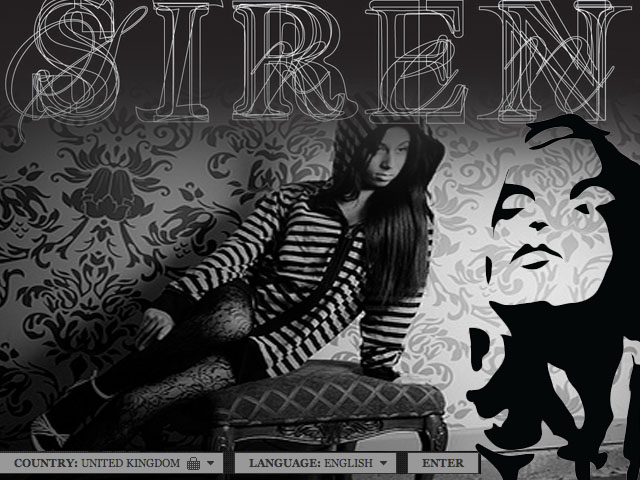
This design for my companys homepage is definitely my favourite, it's very white and clean cut. the type is very elegant and in my opinion it looks like a classy clothing site. The vibrant logo draws your attention and the different layers of type making up the company name is still very easily read.

Clothes Labels

(Image taken from google. Abercrombie Labels)
I like the rustic style of these labels, i think they would make the clothes look of better quality.

Shopping bag designs.

(model wearing urban outfitters image from google.)

I think i like the bag design better with just the logo though!


Billboard Designs


On this billboard design i didnt include the company name as i think the logo is strong enough for people to recognise which shop it is. Again i love the black and white image with the vibrant logo!

This homepage is simply visual, with a small 'enter' button. I really like how the logo and the company name are big and jump out of the screen.
(image taken from Google, model wearing Urban Outfitters)

I love this black and white homepage screen, with just the logo in colour it give quite a nice effect and i think would make people recognise the logo more. The homepage has arrow buttons to click through a selection of styles.
(image taken from google, model wearing urban outfitters)